CoreLife showcases a variety of branding projects that features the four disciplines in medical, nutrition, exercise and behavior.
Year Created: 2022
Format: Environment, Screen, Print
Colleague: Justin Gladden
"In which ways can a promotional display paint an image about the company?"
The Brand:
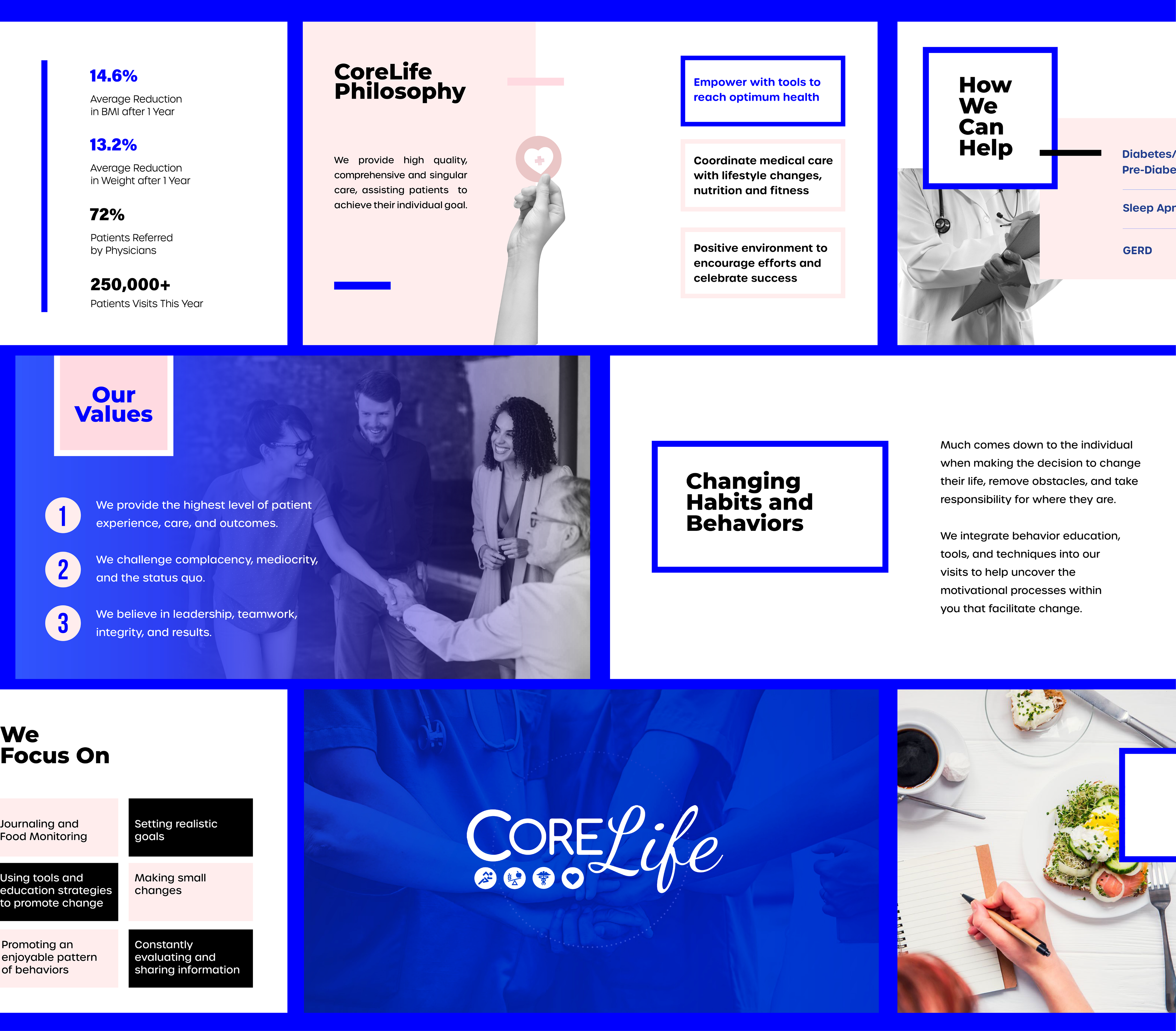
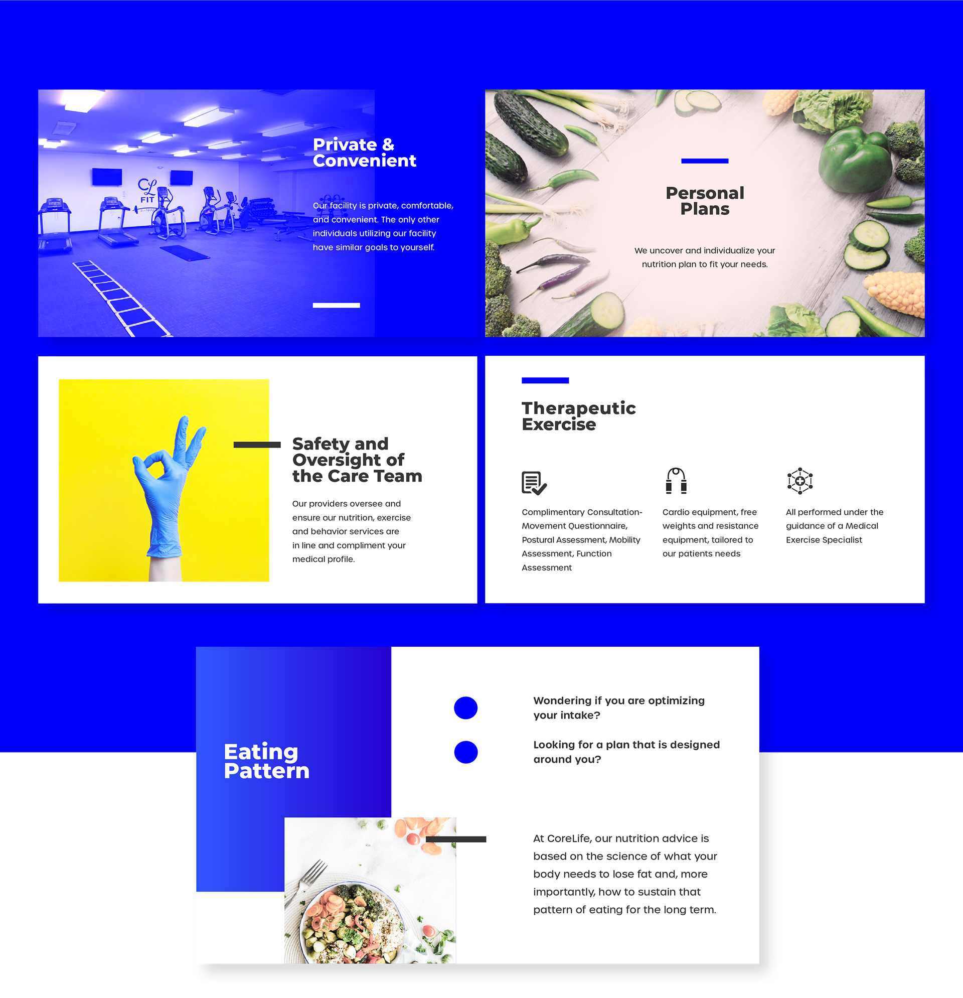
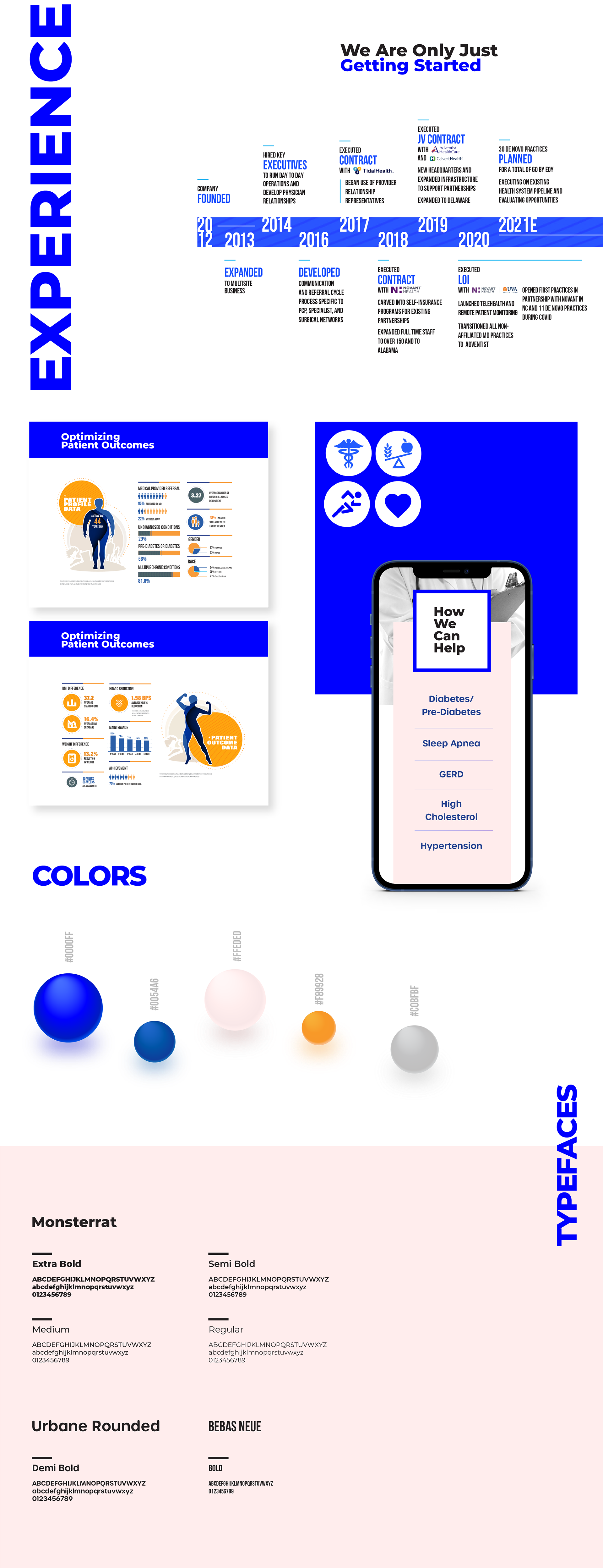
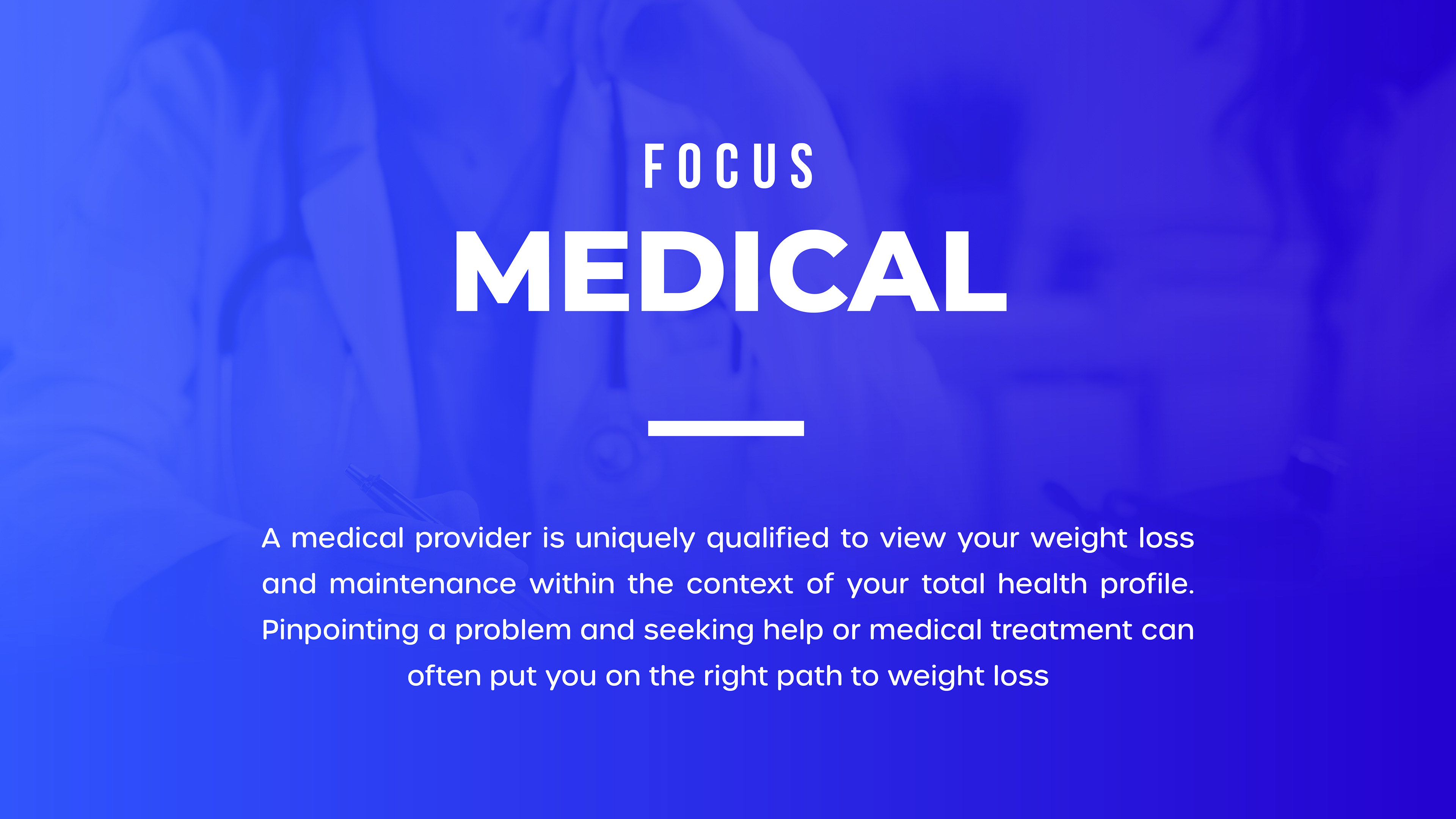
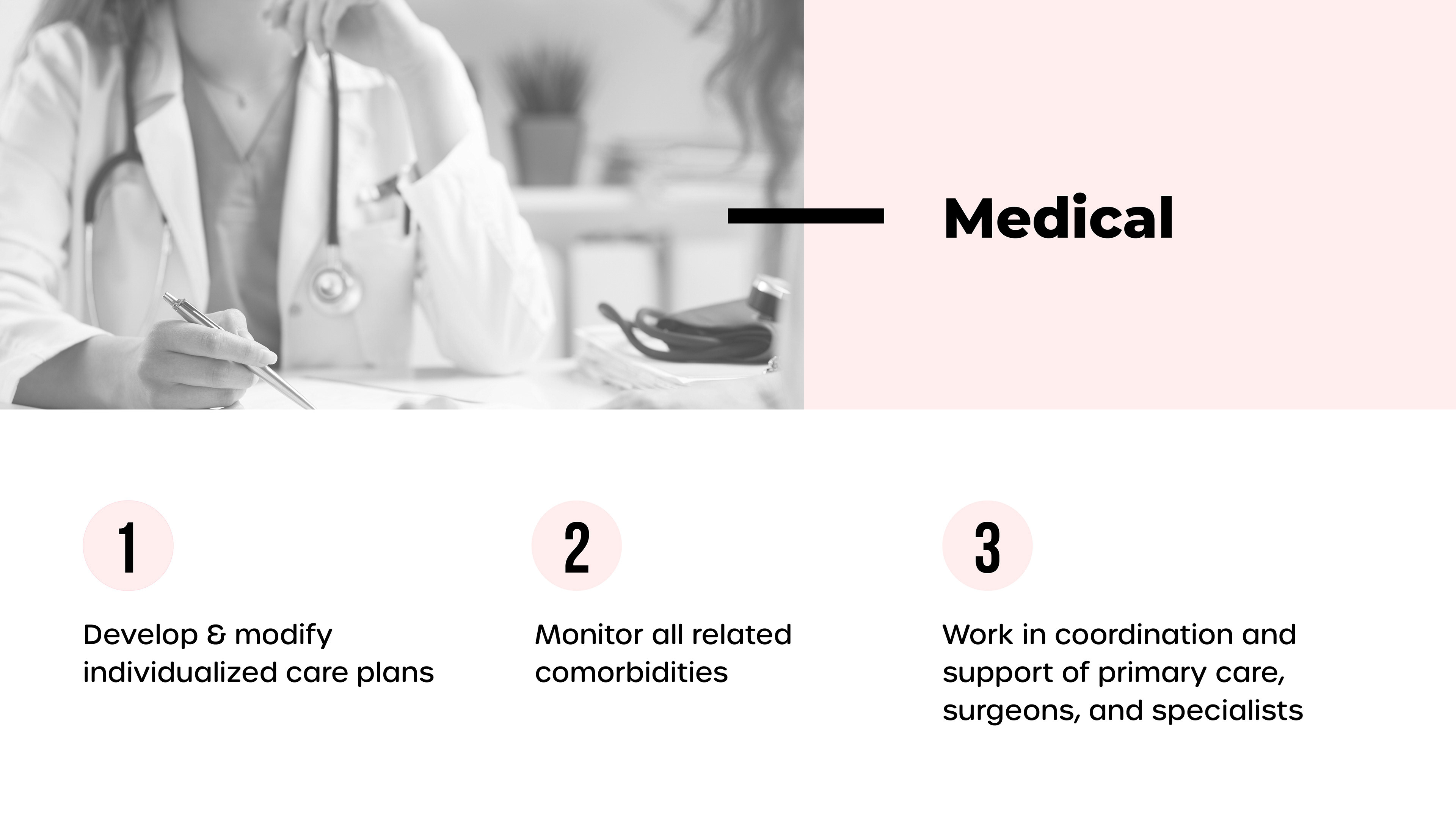
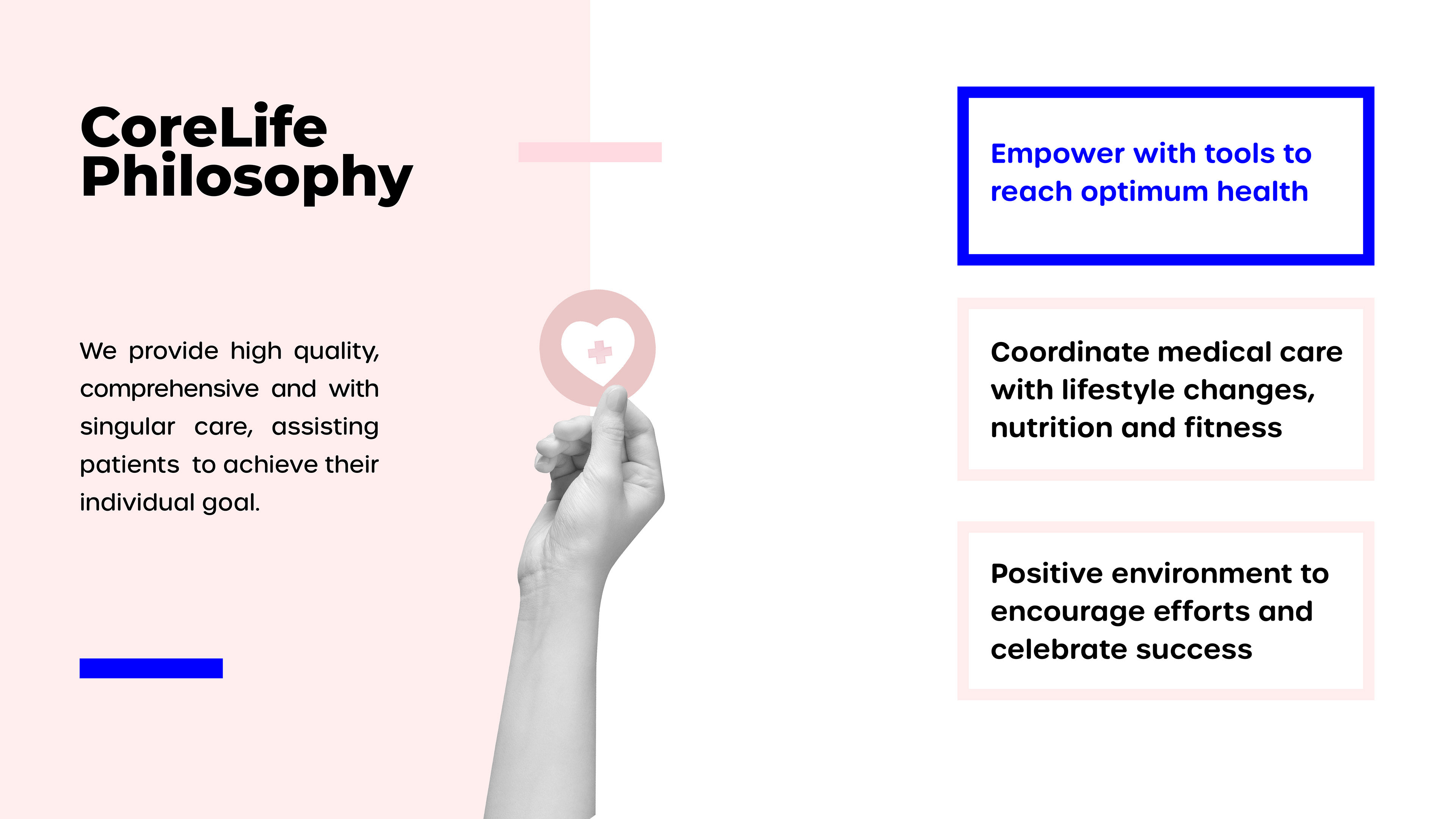
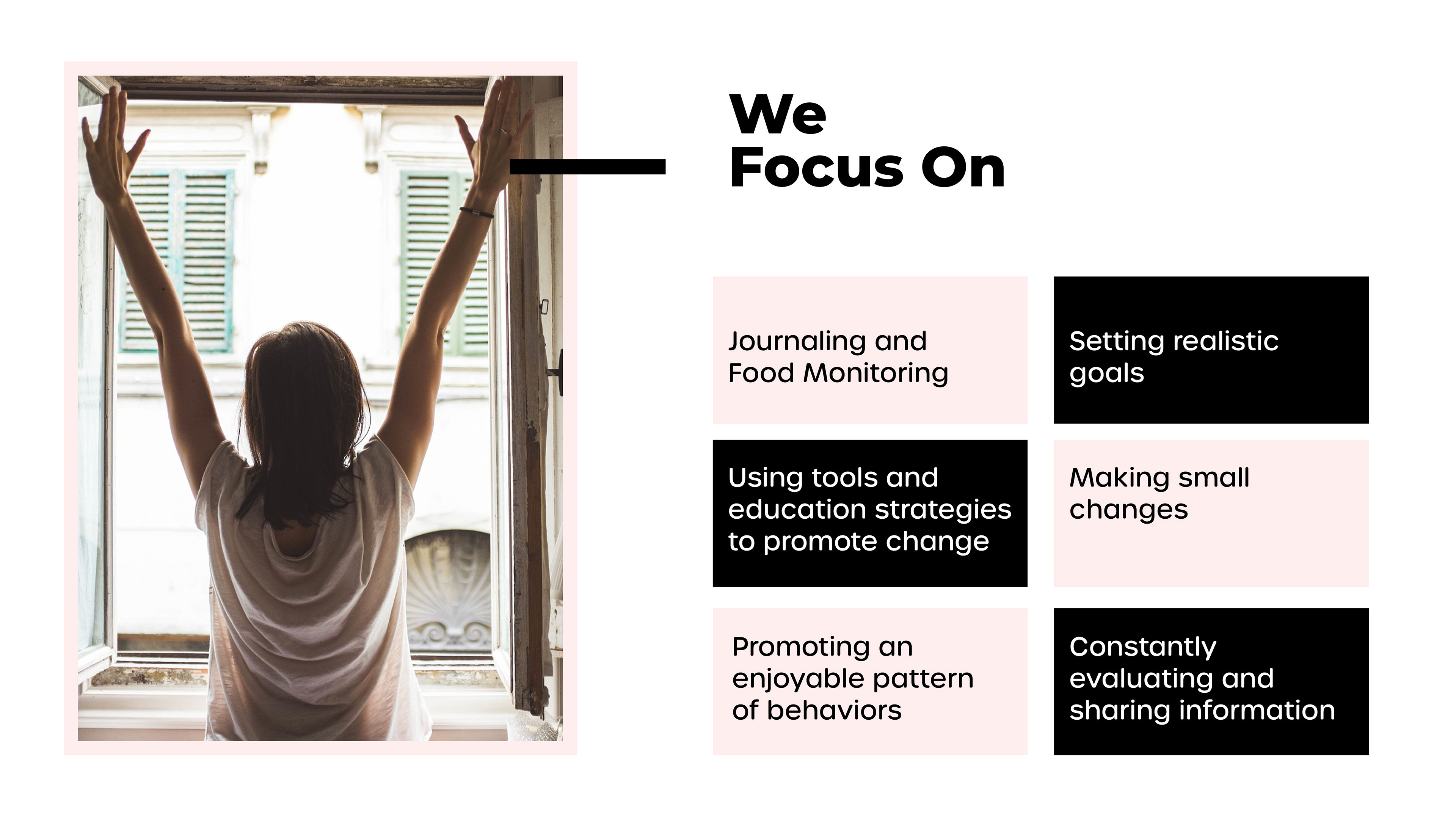
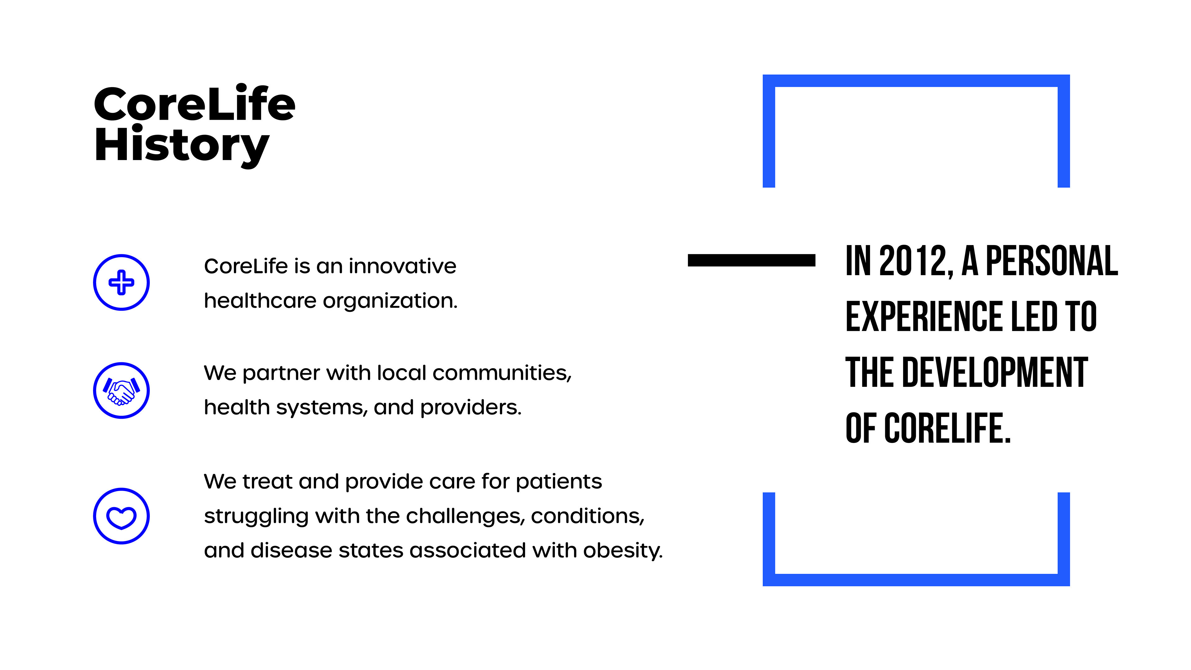
CoreLife is a healthcare organization focused on connecting health systems and communities to provide care for individuals battling obesity and its related chronic conditions. By integrating four key disciplines—medical care, nutrition, exercise, and behavioral support—CoreLife offers a comprehensive approach. Unlike other companies that promote fad diets and extreme fitness regimens, CoreLife strives to empower at-risk patients with a clear, confident path to begin their journey toward better health. The goal of this project is to visually communicate CoreLife’s story—its history, values, philosophy, services, and the positive outcomes achieved by its patients.
The Process:
By understanding and incorporating the core values of each health pillar, the marketing strategy pushes for a clinical and patient-centric approach. My focus was to showcase CoreLife in a light that reflects their welcoming spirit, professionalism and expertise in weight management support.
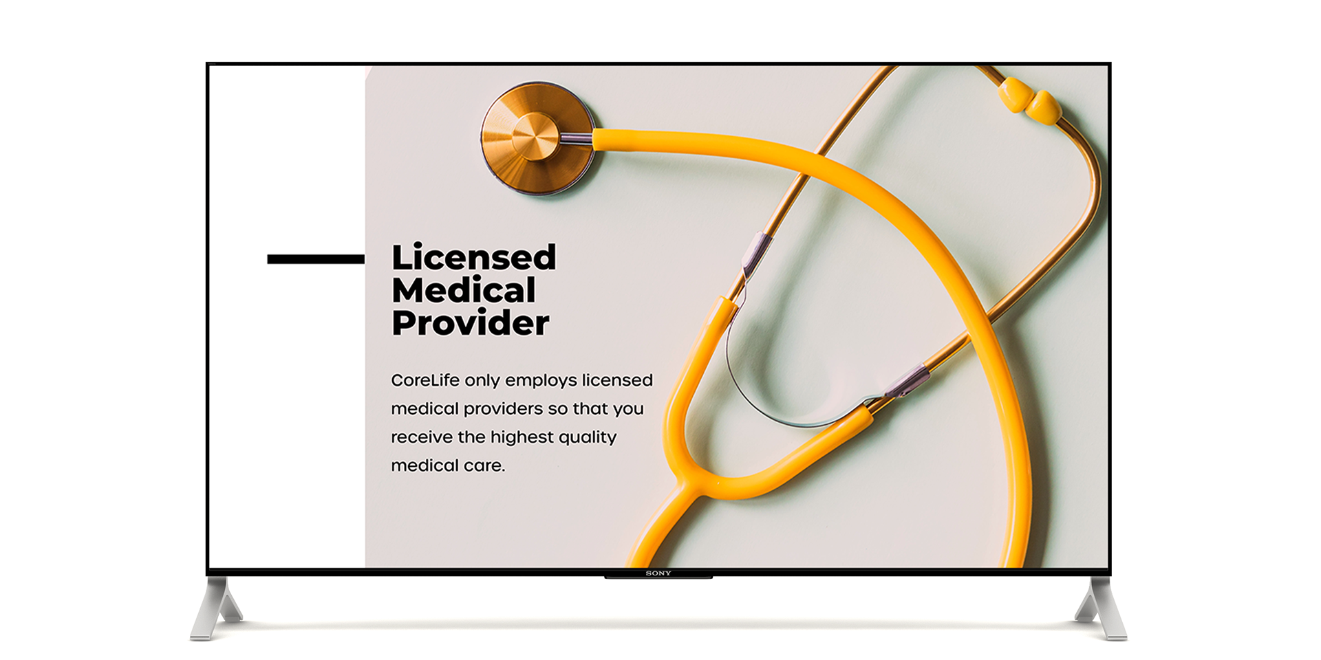
The core brand colors feature vibrant blue, light pastel pink, scrub green and bright orange, accompanied by a neutral palette. Each primary color represents a pillar concentration: blue is exercise, pink is mental health, green is medical care, and orange is nutrition.


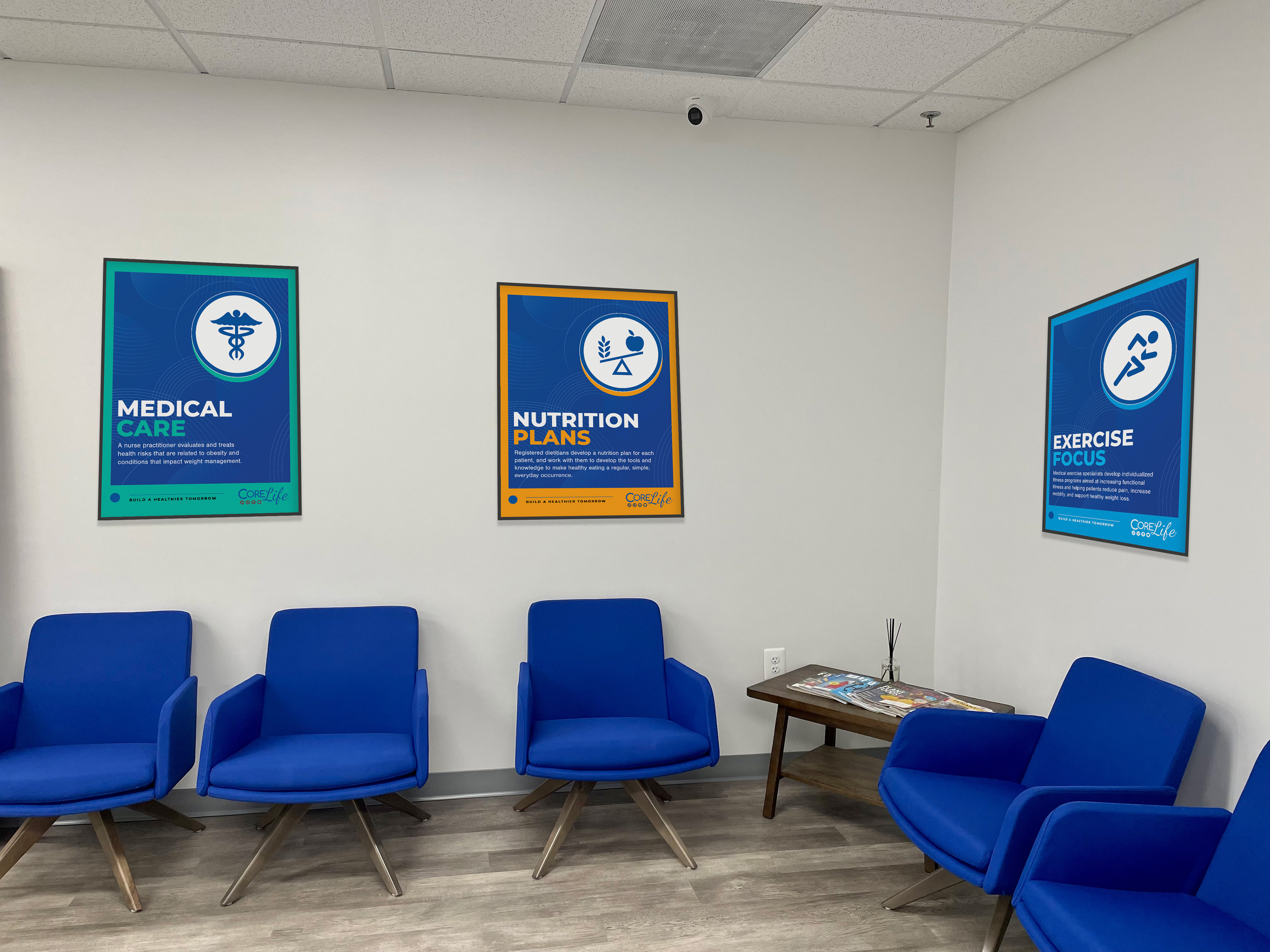
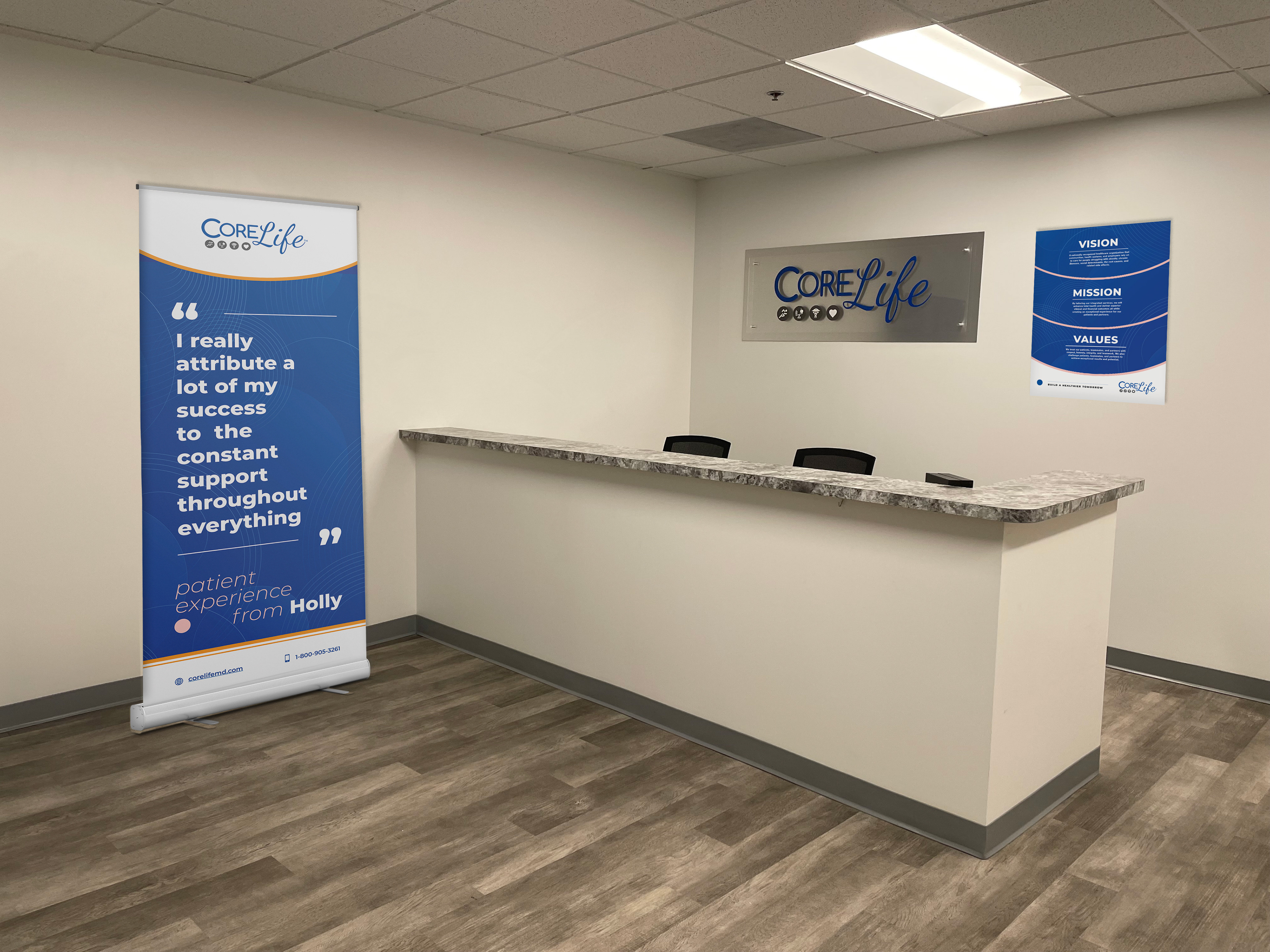
Clinic Office Environment Design:
The displays around the clinic office also got revamped to be on-brand with CoreLife style guidelines.
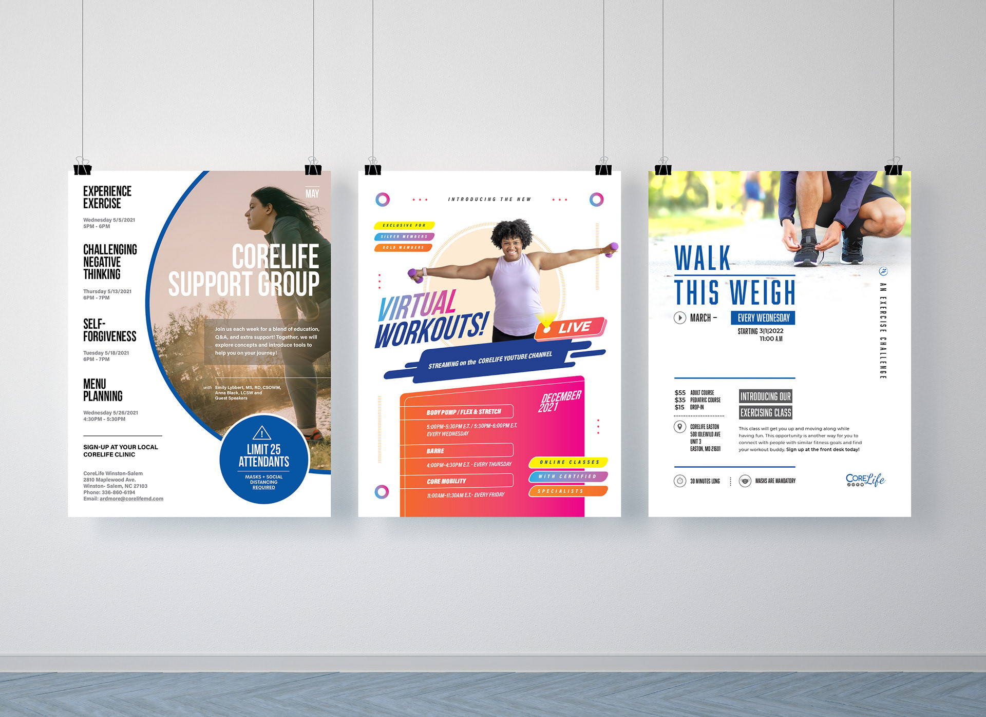
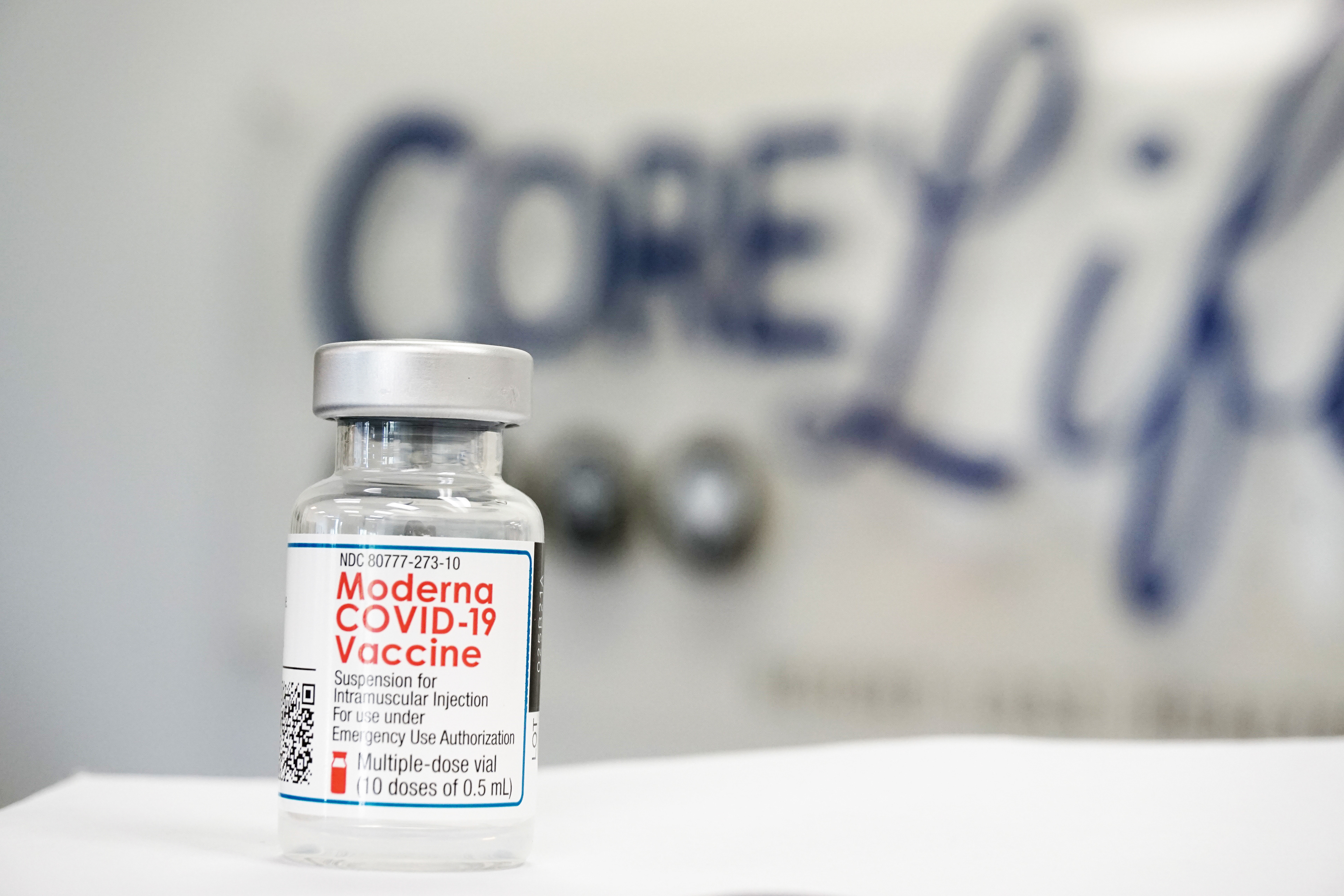
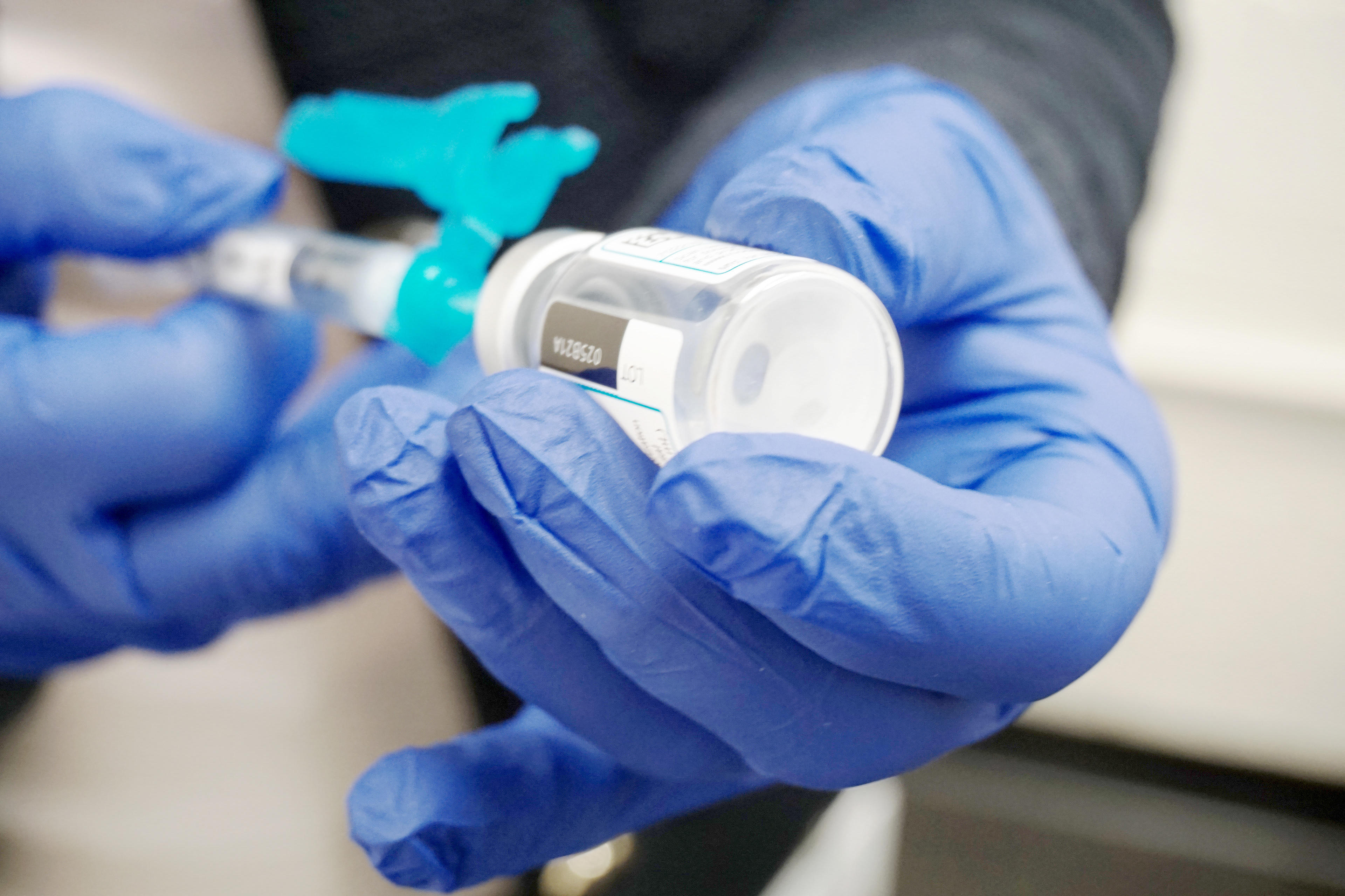
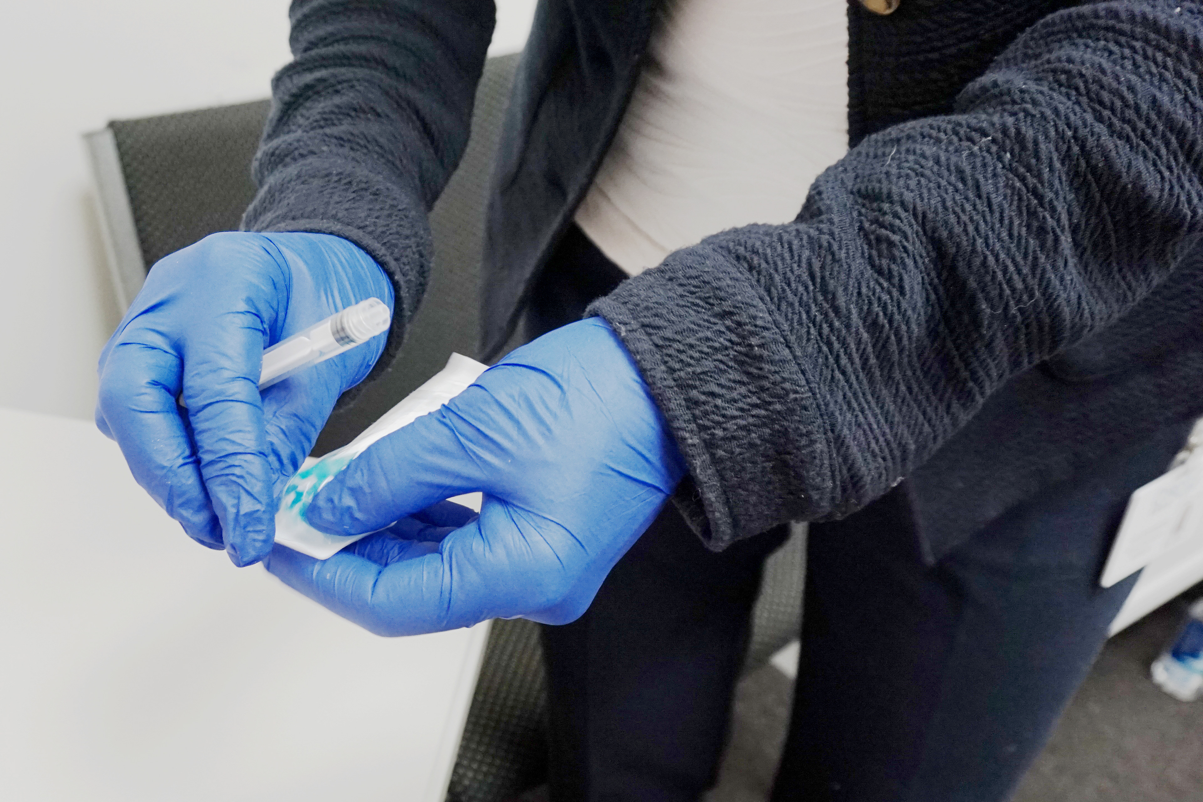
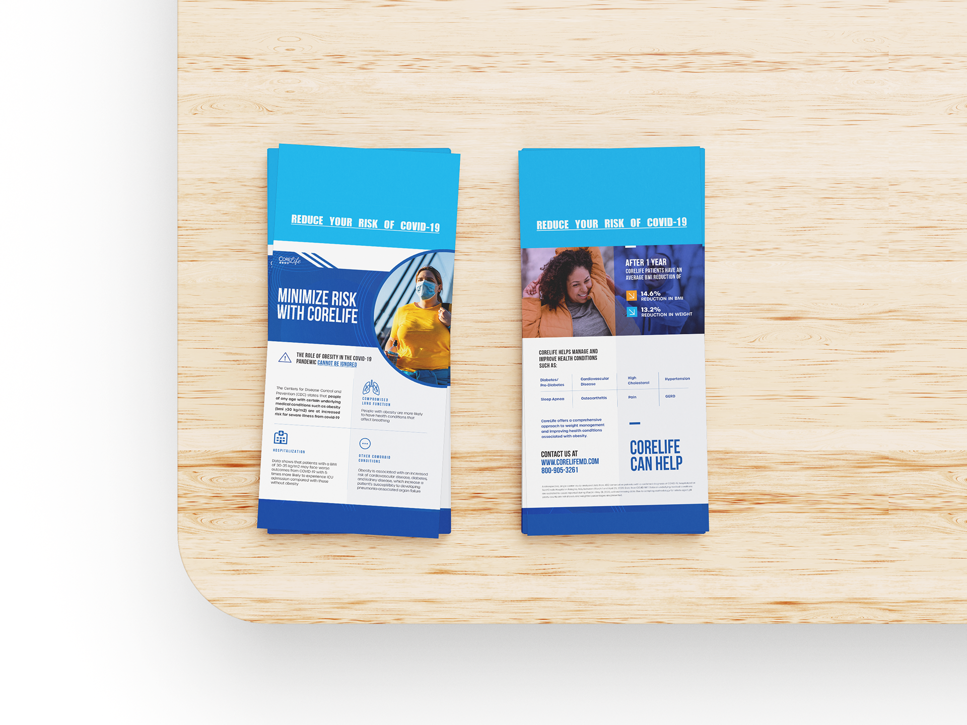
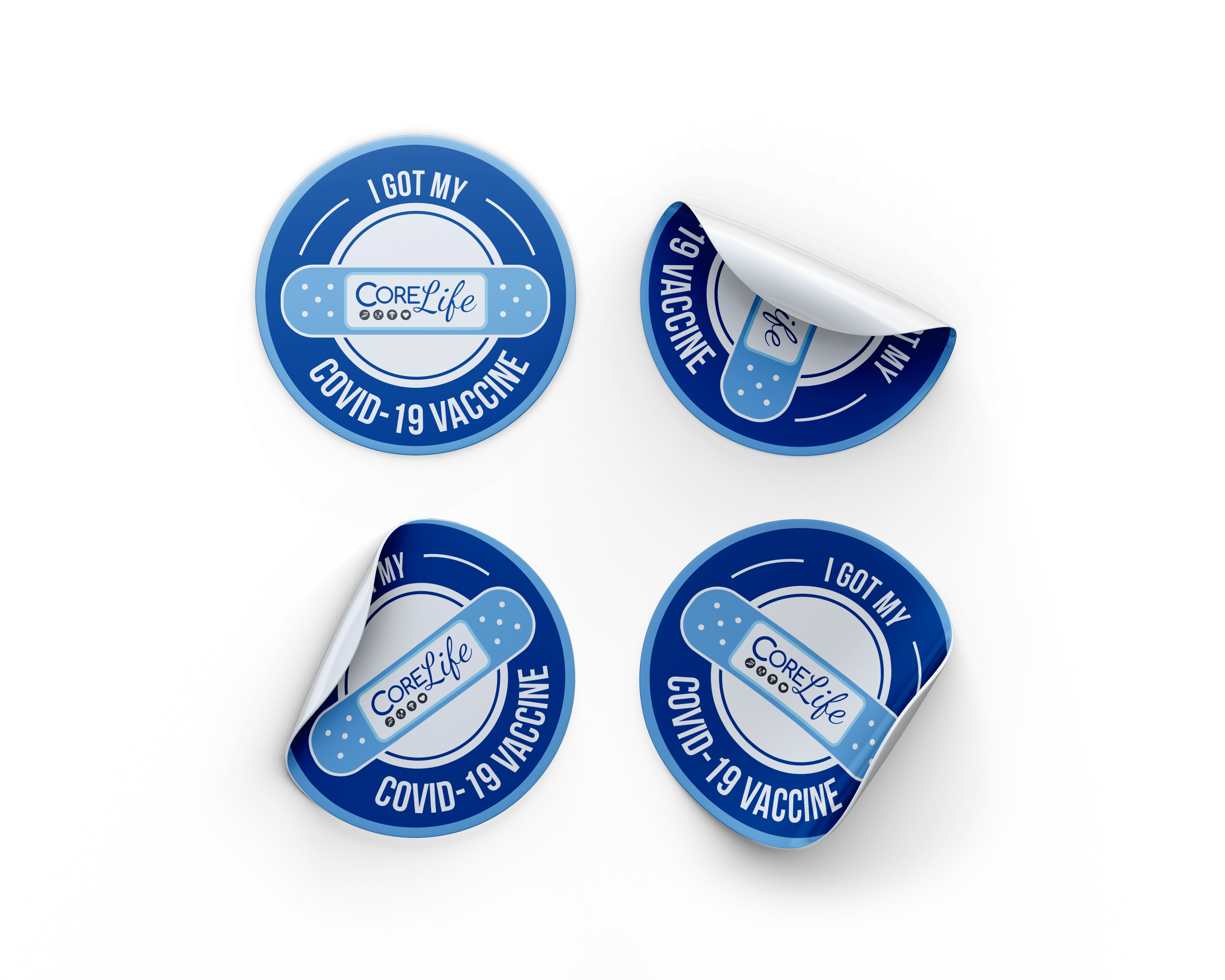
Covid-19 Vaccine Materials:
CoreLife was authorized by Governor Larry Hogan to administer COVID-19 vaccines Maryland residents. To raise awareness and educate the public about this opportunity and the vaccination process, CoreLife is committed to creating promotional materials to effectively communicate these messages.